
Internal · Design system
Style Guide Prime Material
Every token and pattern this site ships, rendered with the real components. The canonical visual reference is the aerial-lift and telehandler landing pages — the rebuild inherits their language verbatim. For layout reference, see /grid-template.
01 · Overview
What this is
A live, browsable manifest of the design system the rebuild ships. Every demo renders through the real components in src/components/; if a value here disagrees with globals.css, globals wins. Use this page when starting a new section or reviewing brand fidelity.
The canonical visual reference is the aerial-lifts + telehandler LPs. Cite-callouts on each sample (e.g. aerial-lifts/index.html line 84) point back to the exact LP source line the pattern came from.
Verbatim from the brand source — LP CSS, the static site styles.css, or the brand asset library. The dominant bucket.
Source implied it but used the value ad-hoc; here it's made explicit (e.g. spacing scale from scattered px values).
New value, justified — almost always a11y (focus rings, reduced-motion gate, contrast ledger).
02 · Color
Color tokens
Every primitive (raw color) and its semantic alias (role-named). Tokens are defined once in globals.css and mirrored as Tailwind colors in tailwind.config.ts.
Orange / Action
E · Extracted--color-orange-500·--action
#FF6B00
Primary CTA, eyebrows, focus ring, link color. Hover on CTAs = opacity 90% (was a darker orange pre-2026-05-23).
Black / Inverse surface
E · Extracted--color-black-900·--surface-inverse
#111112
Header, footer, hero backdrop — the brand IS its own dark theme.
Ink
E · Extracted--color-ink-800·--ink
#1C1C1E
Body text on light, dark feature-section surface (How It Works).
Ink Muted
E · Extracted--color-ink-muted-500·--ink-muted
#6E6E73
Muted captions, spec keys, form labels, table headers, secondary body — every "lighter than ink" role.
Border / Hairline
E · Extracted--color-border-200·--hairline
#D1D1D6
Backing color for 1px-gap hairline grids on light surfaces (118 callers via `bg-line` / `border-line`).
Canvas
E · Extracted--color-bg-100·--surface
#F5F4F0
Default page surface (warm off-white) — every section background that isn't dark/orange/card now sits here post-canvas-warm-retire.
White
E · Extracted--color-white·--surface-card · --ink-on-inverse
#FFFFFF
Card surface + text on inverse/orange (display-size only — see ledger).
Gold
E · Extracted--color-gold-400·--accent-rating
#F5C400
Rating stars only (testimonial component). Never used as text or surface.
03 · Contrast
Contrast ledger
Computed WCAG ratios for every fg/bg pair the design system uses. The white-on-orange rule and the AA-pass body alternative (ink-on-orange) are highlighted — both are load-bearing.
| Foreground | Background | Ratio | Verdict | Role / scope |
|---|---|---|---|---|
| #1C1C1E ink | #F5F4F0 canvas | 16.4:1 | AAA | Default body copy on default surface. |
| #1C1C1E ink | #FFFFFF card | 17.2:1 | AAA | Body text on card surfaces (testimonials, product cards). |
| #6E6E73 ink-muted | #F5F4F0 canvas | 4.6:1 | AA | Subheadings, captions, spec keys, form labels, table headers — every muted-text role. |
| #FFFFFF white | #111112 black | 19.0:1 | AAA | Nav text, footer text, hero body copy. |
| #FFFFFF white | #1C1C1E ink | 16.6:1 | AAA | How It Works step text, dealer band label. |
| #FF6B00 orange | #FFFFFF card | 3.6:1 | AA-large | Eyebrows (display 700 ≥15px) only. Never body. |
| #FF6B00 orange | #F5F4F0 canvas | 3.5:1 | AA-large | Eyebrows on canvas. Never body. |
| #FFFFFF white | #FF6B00 orange | 2.97:1 | FAIL | SCOPED: large display labels only (≥24px / 700+ AND treated decoratively). FORBIDDEN for body copy or links. See callout below. |
| #1C1C1E ink | #FF6B00 orange | 4.9:1 | AA | AA-pass alternative when body-sized text is needed on orange (ink on orange). |
The white-on-orange brand pair is scoped, not deleted: it stays available for display-size brand labels (the CTA button is the canonical case) but is forbidden for body copy. See section 15 for the full callout and the AA-pass alternative.
04 · Type
Typography
Display: Barlow Condensed (700 / 800 / 900, UPPERCASE). Body: Inter (400 / 500 / 600 / 700). Both loaded via next/font with display=swap.
H1 · text-[34px] / 800 / leading-[1.05] mobile, clamp(40,4.8vw,64) / 800 / leading-[0.93] desktopAngledHero + SectionRenderer hero + global h1 (2026-06-07 headline pass)
Aerial Lift Rentals
H2 · clamp(28px, 4vw, 44px) / 900 / uppercaseaerial-lifts/index.html line 121
Our Fleet of Manitou Boom Lifts
H3 · text-[28px] mobile / text-[32px] desktop / 900 / leading-[1.05] (Pillar variant)IndustriesGrid.tsx pillar cards
Material Handling
H4 · 22px / 900 / uppercase
Same-day delivery available
Eyebrow · Barlow Condensed 700 · UPPERCASE · letter-spacing 0.18em · trailing 1px ruleaerial-lifts/index.html lines 119–120 · src/components/EyebrowRule.tsx
Compact Electric
Body · 15px / 400 / line-height 1.7
Sample body copy. We've been renting equipment to contractors across Atlantic Canada since 1994 — that's the depth of bench you'll work with on every quote.
Caption · 11px / 700 / uppercase / 0.1em (form labels)
Working Height
05 · Space
Spacing scale
Source had ad-hoc 6/12/16/32/72; systematized to a 7-step linear-ish scale.
06 · Radius
Border radius
A single 8px rounded corner is the brand signature. --radius: 8px, applied via rounded-brand, is the standard for buttons, inputs and cards. Circular elements (the trust-bar check disc, a few badges) use Tailwind’s built-in rounded-full, and bare images / media frames stay square. There are no other radius tokens — one rule, one corner.
--radius · 8px
E · ExtractedApplied via `rounded-brand` to buttons, inputs and cards — the single brand corner. Circles/pills use `rounded-full`; media frames stay square.
07 · Elevation
Shadow tokens
Three levels only — depth on this brand comes from the 1px-gap hairline grid technique, not stacked shadows.
none
box-shadow: none;
Default. Most surfaces are flat — depth comes from the 1px-gap hairline grid, not shadows.
--shadow-card-hover
box-shadow: 0 8px 32px rgba(0,0,0,0.1);
Card lift on hover. The single card-hover elevation across every grid — ProductCard, BranchCards, Swatch, CategoryCardsGrid, JobCard, CourseList, BrandRangesAccordion. Tailwind: `hover:shadow-card-hover`.
--shadow-overlay
box-shadow: 0 8px 32px rgba(0,0,0,0.35);
Floating panels on dark surfaces — Header navigation dropdown. Same blur as card-hover, stronger alpha for visibility against the dark `--surface-inverse`. Tailwind: `shadow-overlay`.
08 · Motion
Motion tokens
Snappy, never bouncy. Every transition uses the same easing curve. The prefers-reduced-motion media query in globals.css hard-clamps durations to 0ms — required for WCAG 2.3.3.
--motion-fast
150ms
Color/opacity transitions on links and CTAs. Matches the dominant `duration-150` Tailwind class across the codebase.
--motion-base
200ms
Slower transitions — card-hover shadows on ProductCard and CategoryCardsGrid. Matches `duration-200`.
--easing-standard
cubic-bezier(0.2, 0, 0, 1)
Material-style ease-out. Used on every transition. No bounces, no overshoots.
Live hover demo (150ms color transition):
09 · Grid
Grid + breakpoints
Short version below — for the full layout reference (every grid pattern the codebase uses, page composition diagram, live breakpoint badge), see /grid-template. --container-max: 1100px; section padding 92px / 32px. Multi-column layouts use the 1px-gap hairline grid technique — no card borders, dividers are derived from the surface beneath.
sm
640px
Small phones → tablets.
md
768px
Tablets → small laptops. Hero gradient flips to vertical below this.
lg
1024px
Laptops. Most grids upshift to multi-column here.
xl
1280px
Desktops. Beyond `--container-max` 1100px — viewport breathes.
Hairline grid technique (live):aerial-lifts/index.html lines 102, 166, 181 (.proof-grid / .fc-specs / .steps)
57 ft 7 in
Working height
8,818 lb
Capacity
42 ft 11 in
Max outreach
Wrapper uses className="bg-line" + gap: 1px; cells use className="bg-card". The 1px gap shows through as the divider — no borders required.
11 · Forms
Form elements
8px brand corner (`rounded-brand`); 16px input font (prevents iOS focus zoom); orange focus state with no glow/shadow; small uppercase labels above each field. Mirrors LP aerial-lifts/index.html lines 192–203.
Please enter a valid email address.
12 · Sections
Section vocabulary — live
Each sample renders through the real SectionRenderer with a shaped Section object — exactly the path a Sanity-authored page takes. v2 expansions: real-component DealerBand, 3-card testimonial (real TELE_TESTIMONIALS data), ProductCard breakpoint variations, black-default trustBar (orange opt-in), both white-canvas and orange CtaBand surfaces.
Hero — background layout (LP default)aerial-lifts/index.html lines 83–97, 302–315 · markup cloned from SectionRenderer hero case (h1 → p for a11y, audit 3B)
Style guide · Hero pattern
Atlantic Canada's Aerial Lift Rentals
The hero is the LP signature — left-weighted dark gradient over a photo, eyebrow above a giant uppercase H1 with an orange <em> accent block.
Hero — split layout (apex home)SectionRenderer hero case · heroLayout: 'split' (PHASE 8) · markup cloned (h1 → p for a11y, audit 3B)
Atlantic Canada · Since 1994
Material Handling Done Right
The split hero — copy on the left of the black hero, a contained image panel on the right. The image is bounded inside the hero container, never a stretched full-bleed background.
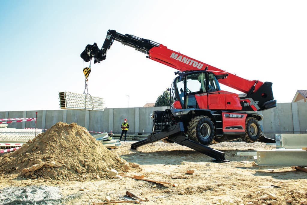
Same black hero, eyebrow, h1-styled lead (rendered as <p> here for a11y — see audit 3B) + orange <em> accent and CTA pair as the background layout — the image just moves into a contained right panel instead of becoming a full-bleed backdrop.
Trust bar — orange (opt-in)aerial-lifts/index.html lines 110–114
- Same-day delivery available
- Authorized Manitou dealer
- Locally owned since 1994
- 80+ field technicians
Trust bar — black (site default)SectionRenderer trustBar case · black default (2026-06-01)
- Same-day delivery available
- Authorized Manitou dealer
- Locally owned since 1994
- 80+ field technicians
Same disc + same content shape as the orange default; only the surface flips to `bg-ink` so a dark hero can extend cleanly into a single dark intro band before the next light section.
Section eyebrow with trailing 1px ruleaerial-lifts/index.html lines 119–120
Compact Electric
Scissor Lifts
The .sec-eyebrow class — orange 15px/700 with .18em tracking and a 1px trailing rule that fills the remaining row width. Now lifted into the shared `EyebrowRule` component — see Components section.
Fleet ProductCard — desktop / tablet / mobile variationsaerial-lifts/index.html lines 156–173 (.fc card)
Desktop · ≥1024px (lg grid · 3-up)
Tablet · 640–1023px (sm grid · 2-up; rendered at 480px max-width)
Mobile · <640px (single column; rendered at 320px max-width)
Image slot intentionally empty in this sample — production cards receive a Sanity-uploaded or harvested asset.
How It Works (3-step dark hairline)aerial-lifts/index.html lines 175–185, 471–481
Simple Process
How It Works
- STEP 01
Request a Quote
Fill out the form or call the number above. Tell us your site location and when you need it — we'll help you pick the right unit. Response within 24 hours.
- STEP 02
Same-Day Delivery
We confirm availability and deliver to your job site anywhere in Nova Scotia, New Brunswick or PEI. Same-day delivery available when you book ahead.
- STEP 03
Full Support On-Site
Every rental includes setup and operator orientation, backed by 80+ field technicians across Atlantic Canada.
Testimonial cards — 3-col grid (v2 default, real data)aerial-lifts/index.html lines 99–107, 483–508 · data from src/content/catalog.ts TELE_TESTIMONIALS
Trusted by Contractors
What Our Clients Say
Dealer band — real component with Manitou logo (bordered variant)src/components/DealerBand.tsx
CtaBand (white-canvas)v2 — single white-canvas variant (drops orange + warm tones)
Ready to Rent?
Get a Quote in Minutes
Response within 24 hours.
CtaBand (orange) — apex 1-800 conversion patternaerial-lifts/index.html lines 188–203, 510–545 · apexCtaSection() helper
Ready to Rent?
Get a Quote in Minutes
Response within 24 hours.
Quote modal triggeraerial-lifts/index.html lines 188–203, 510 (form-sec trigger)
Clicking opens the REAL global modal (mounted in SiteShell). Pre-fills requested_unit so the data path matches the live LP conversion chain.
13 · Home
Home page patterns
Apex-home (/) bespoke compositions added in the PHASE 8 redesign — each rendered through the REAL home component. These sit alongside the shared section vocabulary above; they exist because the home needs a 2-up industries pillar and a 2×3 services grid that the shared SectionRenderer variants do not carry.
Industries card grid — link-only click targetsrc/app/_components/IndustriesGrid.tsx (PHASE 8)
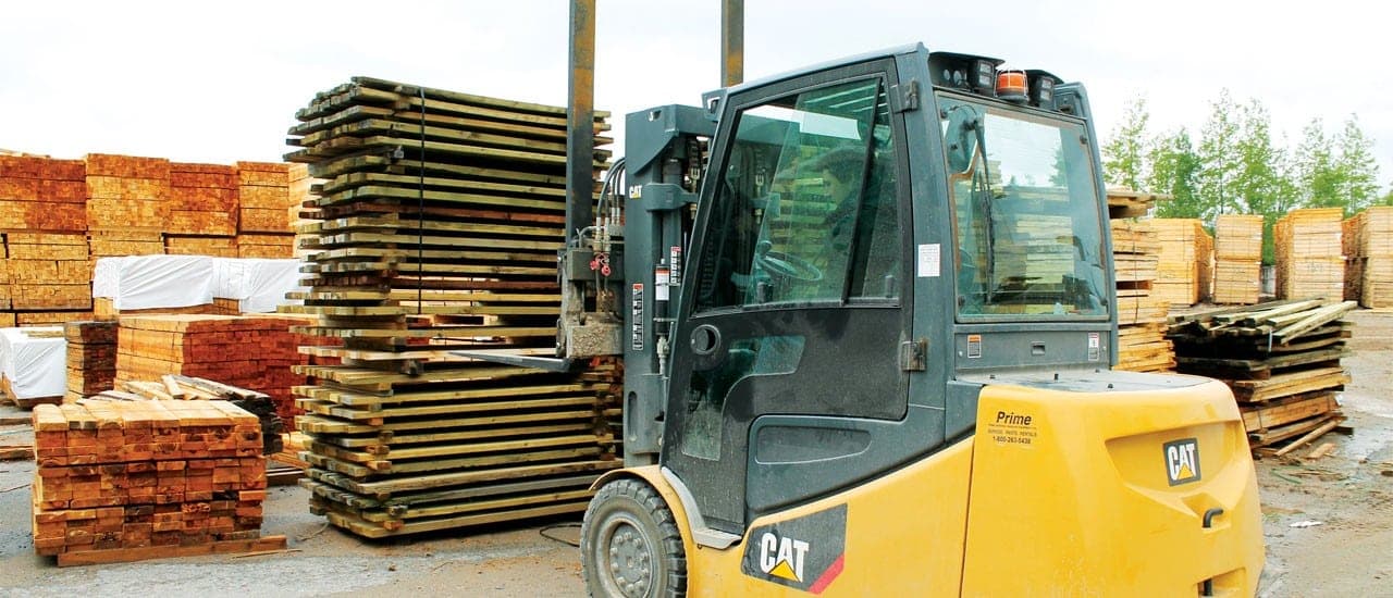
Warehousing
Material Handling
Forklifts, reach trucks, pallet trucks, order pickers and multi-directional sideloaders — electric, diesel and LPG — from CAT, Crown, Jungheinrich, Mitsubishi and Combilift. Sales, service and support across Atlantic Canada.
Explore Material Handling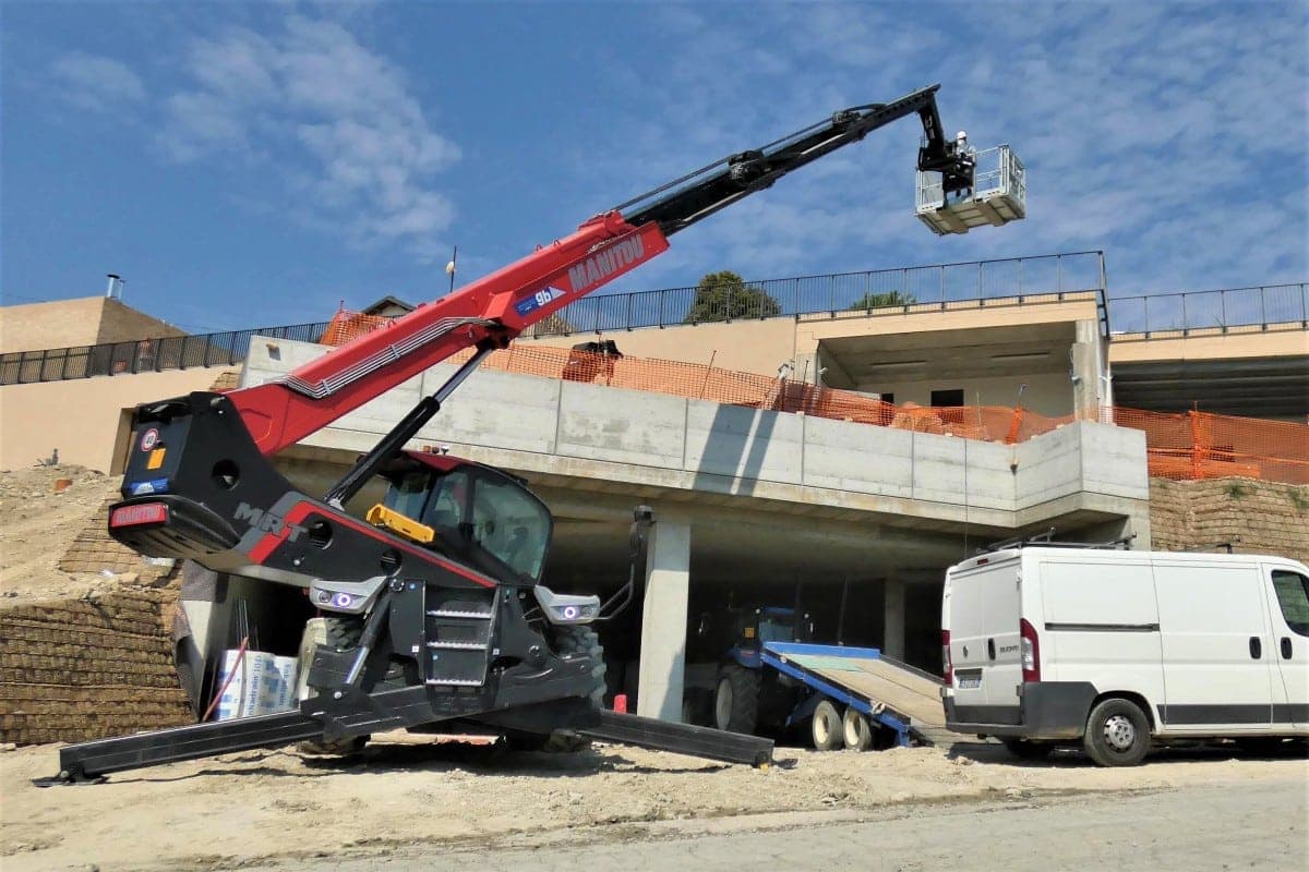
Job Sites
Construction Equipment
Manitou telehandlers, skid and track loaders, aerial lifts and rough terrain forklifts — built for the most demanding job sites across Nova Scotia, New Brunswick and PEI. Brand-new fleet, same-day delivery available.
Explore Construction EquipmentThe card is a plain <article>; only the orange "Explore …" anchor navigates. Eyebrow stays orange (label); the body paragraph is black — orange is never body copy.
Services grid — 2×3 numbered hairline cardssrc/app/_components/ServicesGrid.tsx (PHASE 8)
Services We Offer
Everything to Keep You Running
From equipment sales and rentals to maintenance, fleet management and operator training — Prime Material Handling is your single partner for material handling and construction equipment across Atlantic Canada.
14 · Body color
Body copy is black — orange is not body text
Orange (#FF6B00) is reserved for eyebrows, labels, links and CTAs. It is never body-paragraph text. Body copy on a light surface is always ink (#1C1C1E). This rule was applied in PHASE 8 to the Industries card paragraphs (previously orange-tinted).
Correct · black body, orange label
Material Handling
Forklifts, reach trucks, pallet trucks and order pickers from the brands you trust — sales, service and support across Atlantic Canada.
Wrong · orange body copy
Material Handling
Forklifts, reach trucks, pallet trucks and order pickers from the brands you trust — sales, service and support across Atlantic Canada.
Orange body text reads at only 3.5:1 on canvas — fails AA (see section 15). Reserve orange for the label above and the link below the paragraph.
15 · A11y rule
White-on-orange — scoped, not deleted
The brand's primary CTA pair is white text on #FF6B00. Its computed ratio is 2.97:1 — below WCAG AA for body text (4.5:1). We keep it, but scope it.
Allowed · display-only (≥24px / 700+)
Heavy weight + large size pulls the pair across the AA-large 3:1 threshold for non-text contrast. CTA button is the canonical use.
Forbidden · body copy
Body-sized white on orange fails AA at 2.97:1 — a known accessibility regression.
AA-pass alternative · ink-on-orange
For inline emphasis, an ink + orange left-border or ink + orange underline reads at full AA.
16 · Dark mode
Dark-mode posture
v1 has no toggled dark theme. The brand expresses dark surface natively — the header, footer, hero backdrop, and feature sections (How It Works, dealer band, quote modal) all render on --surface-inverse / --ink. The brand IS its own dark surface system; a user-controlled toggle would introduce a second token set with no client requirement. Re-evaluate post-launch.
--surface-inverse · #111112
Header chrome, footer, hero backdrop. Phone numbers, nav links, and the "Get a Quote" CTA all live on this surface.
--ink · #1C1C1E (feature sections)
How It Works, dealer band, and the quote modal use the slightly-lighter ink for visual distinction from the chrome while keeping the dark-surface posture intact.
17 · Components
Components catalog
Every production component the rebuild ships — shared primitives in src/components/ first, then route-scoped patterns under src/app/<route>/_components/. Each entry carries a live sample (where the component renders meaningfully in isolation), the props API, the source file, and the routes that consume it. New from PR A: EyebrowRule, BranchesBand, BenefitsGrid (moved to src/components/). New from PR #58: MediaFrame. New from PR #48: FaqList. New from PR #33: VideoStorySection.
Shared · src/components/
Cross-route components — promoted up because two or more routes import the same shape, or because they own a system-wide primitive (Portable Text serializer, fleet card, button, modal). Every shared component carries a doc comment in the file explaining what lifted it.
Button (CtaButton / QuoteTriggerButton)
src/components/Button.tsx
Brand button that maps a Sanity `cta` to one of three variants (primary / ghost / dark) with the full state matrix. `quoteModal` action opens the global modal; `phone` / `link` resolve to the right element. Hover treatment: primary + ghost = opacity-90 drop, dark = background shift to orange. See Section 10 (Buttons) for the full state matrix.
Live sample
Props
<CtaButton
  cta={{ label: string; action: "quoteModal" | "phone" | "link"; variant?: "primary" | "ghost" | "dark"; href?: string }}
  phone?: string
/>

<QuoteTriggerButton label={string} variant?={"primary" | "ghost" | "dark"} />
Used by
- SectionRenderer (every variant with CTAs)
- Header (mobile + desktop quote CTAs)
- Footer (apex CTA row)
PortableBody
src/components/PortableBody.tsx
Constrained Portable Text serializer (website-design-system §C). One styled rule per allowed node — h2/h3, normal paragraphs, bullet/number lists, blockquote, strong/em, link, imageWithAlt, callout. The editor's block set deliberately omits h1/h4+ so the page always renders exactly one H1 from its title (SEO protection).
Live sample
Sample body paragraph with a bolded clause and a Sanity-authored link mid-sentence.
H2 inside body
- First list item
- Second list item
Props
<PortableBody value?={PortableTextBlock[]} />

// Allowed marks: strong, em (rendered as semibold; no italic face shipped), link
// Allowed types: imageWithAlt (figure + figcaption), callout (warm aside w/ orange border)
Used by
- FALLBACK_PAGES (every Sanity-authored page body)
- /about, /careers, /training — long-form copy blocks
ProductCard
src/components/ProductCard.tsx
Fleet card — the LP `.fc` component reproduced 1:1. Image wrap → 32/900 uppercase name + model sub → orange Available / muted Call badge → 2×2 hairline spec grid → full-width dark CTA (orange on hover). Equipment items carry no price and a summary instead of the spec grid (USER DECISION: no cart, store → quote-request).
Live sample
Props
<ProductCard
  product={Product}        // Sanity Product type — name, slug, category, specs, image, …
  containImage?={boolean}  // Opt into aspect-[3/2] + object-contain for full-photo visibility (defaults off; used on /construction/scissor-lifts)
/>
Used by
- SectionRenderer productShowcase variant
- FleetCarouselFirstRow (construction sub-pages)
- /used-equipment listing
MediaFrame
src/components/MediaFrame.tsx
Shared fixed-aspect image frame with placeholder background. Lifted from 5 near-identical inline implementations across IndustriesGrid, BrandRangesAccordion, CategoryCardsGrid, CourseList, and SectionRenderer productSpotlight. Centralizes the placeholder-bg decision so future token sweeps touch one file instead of five (NEW from PR #58).
Live sample
16/10 default · empty
4/3 · warm placeholder
1/1 square
Props
<MediaFrame
  image?={SanityImage}
  alt?={string}
  aspect?={"16/10" | "4/3" | "1/1" | "16/9"}    // Default 16/10
  sizes?={string}                                 // next/image sizes; default "(max-width: 768px) 100vw, 540px"
  className?={string}
  fit?={"cover" | "contain"}                      // Default cover
  objectPosition?={string}                        // Tailwind utility e.g. "object-top"
  bg?={"canvas" | "warm"}                         // Empty-state surface; default canvas
/>
Used by
- IndustriesGrid (home pillar cards)
- CourseList (training cards)
- SectionRenderer productSpotlight
EyebrowRule
src/components/EyebrowRule.tsx
The LP `.sec-eyebrow` signature — orange uppercase label + trailing 1px hairline that flexes to section width. Lifted from 11+ inline duplicates in Phase 2A.2. API mirrors `SectionRenderer.Eyebrow` so a future merge could collapse both to a single import without a prop-surface change.
Live sample
Light surface — bg-line trailing rule
Dark surface — white/10 trailing rule
Props
<EyebrowRule
  text={string}
  dark?={boolean}     // Dark-surface variant — switches the trailing rule colour (bg-white/10 vs bg-line)
  className?={string} // Extra classes on the outer <p>
/>
Used by
- /contact (Our Locations)
- /training (Course Catalog / Schedule / What's Included)
- /careers (Open Positions)
- /construction BenefitsGrid (rental benefits, post-2026-05-25 rentals merge)
- /construction BrandRangesAccordion
BranchesBand
src/components/BranchesBand.tsx
Shared shell for the 'warm-canvas band with a card grid' composition (now used on /careers; /contact moved to LocationsSection, /about was removed). Owns the section element, surface bg, eyebrow + heading + optional subheading slot, and the max-width container. Each caller slots its own card grid as children — the grid gap differs per caller (hairline grid vs gap-4 vs gap-6) so the grid stays at the call site.
Live sample
Demo Band
BranchesBand Shell
Owns the eyebrow + heading + max-width container + section padding. Callers slot their own card grid as children — the grid pattern stays at the call site because it varies by caller (hairline-grid vs gap-4 vs gap-6).
Slot
Card A
Slot
Card B
Slot
Card C
Props
<BranchesBand
  eyebrow={string}
  heading={string}
  subheading?={ReactNode}   // Render-prop slot so callers can inline links
  anchorId?={string}        // id on the outer <section> for in-page anchors
  children={ReactNode}      // The card grid
  className?={string}
/>
Used by
- /careers (Current Openings list with JobCard)
BenefitsGrid
src/components/BenefitsGrid.tsx (moved from rentals/_components/ in Phase 2A.2)
Long-form numbered-card cluster — 3-4 verbatim H3s rendered as an LP-style hairline grid of prose cards. Each card = orange 'BENEFIT 0N' eyebrow → uppercase H3 → body paragraph. Cluster-local numbering via the startIndex prop lets two BenefitsGrid instances chain. Agnostic to whether items are 'benefits' or 'programs' or 'pillars' — /training renders 5 program areas, /careers renders 7 culture pillars.
Live sample
Sample Benefits
Why Customers Choose Us
Numbered hairline grid — cluster-local numbering via the startIndex prop lets two BenefitsGrid instances chain (01-03 in the first, 04-06 in the second).
- BENEFIT 01
Local Service Bench
80+ certified field technicians across Nova Scotia and New Brunswick — the largest material handling service bench in Atlantic Canada.
- BENEFIT 02
Same-Day Delivery
Confirmed dispatch from the nearest of three branches — Dartmouth NS, Saint John NB, Moncton NB — when you book ahead.
- BENEFIT 03
Authorized Dealer
Manitou for telehandlers and aerial; CAT, Crown, Jungheinrich, Mitsubishi and Combilift across the broader fleet.
Props
<BenefitsGrid
  eyebrow={string}
  heading={string}
  subheading?={string}
  benefits={Array<{ title: string; paragraphs: string[] }>}
  startIndex?={number}              // Default 1
  tone?={"light" | "dark"}          // Default light (bg-canvas / text-ink)
  anchorId?={string}
/>
Used by
- /construction (Why Rent + Service That Backs Up the Fleet — 4 benefits each, light + dark interleaved, post-2026-05-25 rentals merge)
- /used-equipment (programs)
- /training (5 program areas)
- /careers (7 culture pillars)
QuoteModal · QuoteForm
src/components/QuoteModal.tsx · QuoteForm.tsx
Global quote modal — rendered once in SiteShell, opened by any CTA via the QuoteModalProvider. Dark LP `.modal-content` (4px orange top border, sharp corners, dark form fields). QuoteForm: 4 visible fields (name, phone, email, message; client rule = phone OR email required), hidden GCLID + 5 UTM fields + `requested_unit`. Conversion fires on Formspree success only via `dataLayer.push({event:'form_submit', form_type})`.
Live sample
Quote modal triggeraerial-lifts/index.html lines 188–203, 510 (form-sec trigger)
Clicking opens the REAL global modal (mounted in SiteShell). Pre-fills requested_unit so the data path matches the live LP conversion chain.
Props
<QuoteForm
  formId?={string}                                                                 // Formspree endpoint ID (env-driven)
  formType={"aerial_lift" | "telehandler" | "scissor_lift" | "general"}            // Load-bearing for GTM conversion attribution
  subject={string}
  source={string}
  requestedUnit?={string}
  compact?={boolean}
  dark?={boolean}    // LP modal context — inverts label/help colours (fields stay white)
/>
Used by
- Global QuoteModal (every CTA route via useQuoteModal())
- LP modal endpoints (aerial / telehandler / scissor)
Route patterns · src/app/<route>/_components/
Patterns scoped to a single route folder. Kept private until a second consumer appears — Next.js `_components/` convention treats these as route-local. When a third route copies the shape, the pattern lifts to src/components/ (see audit 1a-pages-v2-conformance-2026-05-24 §5 for recent lifts).
VideoStorySection
src/app/_components/VideoStorySection.tsx
Home position-3 video story — 2-column layout (video left at md+, copy right), stacks at sm. 16:9 video panel with autoplay + muted + loop + controls + playsInline. Inline CTA at the end of the final paragraph (orange text link, not a standalone button). NEW from PR #33.
Live sample
Our Story
Atlantic Canada's Material Handling Partner
Demo body paragraph — the live home page composes 3-4 paragraphs sourced from `_content.ts`. The inline CTA renders at the end of the final paragraph (orange text link, not a standalone button). About Prime Material →
Props
<VideoStorySection
  story={HomeVideoStory}    // { eyebrow, heading, body: string[], video: {src, alt}, cta: {label, href} }
/>
Used by
- / (home page, between trust bar and industries grid)
IndustriesGrid
src/app/_components/IndustriesGrid.tsx
Home 2-up pillar grid (Material Handling + Construction). PHASE 8 corrections: 24px gap (not 1px hairline), no hover-zoom, link-only click target (card body is plain <article>), black body copy (orange is not body text). See LiveSamples section (Home patterns) for a real-data render.
Props
<IndustriesGrid pillars={IndustryPillar[]} />
// IndustryPillar: { title, eyebrow, body, ctaLabel, href, image?, imagePosition? }
Used by
- / (home page, industries pillar section)
ServicesGrid
src/app/_components/ServicesGrid.tsx
Home 5-card service grid — PHASE 8 2-rows × 3-columns layout (was a single row of 5). Numbered cards (NOT 'STEP 01' — services are unsequenced categories). Trailing empty cell pads the rectangular hairline frame. See LiveSamples section (Home patterns) for a real-data render.
Props
<ServicesGrid services={ServiceItem[]} />
// ServiceItem: { title, detail, href? }
Used by
- / (home page, services section)
BrandRangesAccordion
src/app/construction/_components/BrandRangesAccordion.tsx
Native `<details>` accordion with brand cards — 6 items (Manitou expanded by default, then CAT, Crown, Jungheinrich, Mitsubishi, Combilift collapsed and multi-open independent). Manitou cards link to /construction/<slug> sub-pages; non-Manitou cards open the global QuoteModal pre-filled with brand + product-line `requestedUnit`. Built on native <details>/<summary> for built-in keyboard a11y and no-JS-required collapse behavior.
Props
<BrandRangesAccordion brands={BrandRange[]} categories={ConstructionCategory[]} />Used by
- /construction (hub page)
DealerBand
src/components/DealerBand.tsx
Clickable dark `--ink` band carrying the Manitou partner logo + 'Ready to Rent' wordmark (the underlined action word is `<span class='dealer-band-action'>`). Entire row is keyboard-focusable and opens the global QuoteModal. `bordered` prop (default false) adds top + bottom 1px `white/10` hairlines — construction sub-pages opt in to interrupt between fleet-card rows. Merged 2026-05-24 from the two near-identical construction + rentals lane-local copies (audit 3N P3, finding 3N-5).
Props
<DealerBand bordered?={boolean} /> // default false — opt-in white/10 top+bottom hairlinesUsed by
- /construction/telehandlers (bordered)
- /construction/skid-steers-loaders (bordered)
- /construction/aerial-lifts (bordered)
FleetCarouselFirstRow
src/app/construction/_components/FleetCarouselFirstRow.tsx
First-row fleet showcase — mobile swipe carousel, desktop grid. Pure CSS scroll-snap (no JS); each card takes 85% of viewport width on mobile so the next card peeks in from the right edge as a self-evident swipe affordance. Bespoke (not a SectionRenderer variant) per the project rule that forbids modifying SectionRenderer.
Props
<FleetCarouselFirstRow
  section={Section}              // Sanity-shaped productShowcase section
  containImages?={boolean}       // Forward to ProductCard containImage
  keepCarousel?={boolean}        // Force the > 3 overflow-carousel pattern even for ≤ 3 cards (for paired rows)
/>
Used by
- /construction/telehandlers (first row)
- /construction/scissor-lifts (containImages=true)
- /construction/aerial-lifts
JobCard
src/app/careers/_components/JobCard.tsx
Careers job-card — LP `.fc` card-feel adapted for a job opening: flat sharp-cornered card with hairline border, orange location eyebrow + trailing rule, 22/900 display title, 3-line summary clamp, dark→orange 'View Job' CTA pill linking to /careers/<slug>. Job applications go to hr@primematerial.com (06 §2.8/§2.9) — NOT the global quote modal.
Props
<JobCard
  post={JobPost}      // { slug, title, intro, … }
  location={string}   // Branch label for the eyebrow
/>
Used by
- /careers (Current Openings list)
CourseList
src/app/training/_components/CourseList.tsx
Hairline-grid course list (Phase 6). Each card opens the global QuoteModal pre-filled with `requested_unit = 'TRAINING — <course name>'` — the 'TRAINING — ' prefix is a deliberate marker so the operator + GTM can distinguish a training-course reservation from an equipment-rental quote. Meta dt/dd rows render only when data is present (no fabrication).
Live sample
Operator
Lift Truck Operator Certification
Foundational counterbalance, reach truck, and order picker training. Practical assessment included.
- Schedule
- 1 day · Dartmouth NS
- Who it's for
- New operators + refresh
- Certification
- CSA Z459 / OHSR compliant
Props
<CourseList courses={TrainingCourse[]} />
// TrainingCourse: { slug, name, tag, description, duration?, audience?, certification?, imageSrc? }
Used by
- /training (Course Catalog section)
TrainingSchedule
src/app/training/_components/TrainingSchedule.tsx
Responsive table/cards pattern — `hidden md:block` desktop table + `md:hidden` mobile stacked cards. Both views render the same data through hairline 1px-gap grids. Pricing sourced verbatim from 06 §2.6; rows without published pricing render 'Quote on request' rather than fabricated numbers.
Live sample
Course
Lift truck operator certification
Schedule
Weekly · Dartmouth NS
Pricing
$180 + HST · $50 deposit
Includes practical assessment.
Course
Aerial work platform
Schedule
On-demand · on-site
Pricing
Quote on request
Props
<TrainingSchedule rows={TrainingScheduleRow[]} />
// TrainingScheduleRow: { course, schedule, cost, notes? }
Used by
- /training (Schedule & Pricing section)
FaqList
src/components/FaqList.tsx (lifted from rentals/_components/ 2026-05-25 when /rentals was deleted and the FAQ cluster moved to /construction)
All-expanded FAQ list with server-rendered FAQPage JSON-LD wrapped accordion. Semantic `<dl>` with `<div>` wrappers around each `<dt>`/`<dd>` pair. No JS interaction (no accordion, no collapse). The JSON-LD script tag is escaped against `</` breakout. Eyebrow/heading are props — default to 'Common Questions' / 'Rental FAQ'.
Live sample
Common Questions
Rental FAQ
Do you deliver to my job site?
Yes — same-day delivery is available across Nova Scotia, New Brunswick, and PEI when you book ahead. Tell us the site location on your quote.
Do you carry insurance on rented equipment?
Yes — every rental ships with the standard liability + physical damage waiver. Talk to your account manager about extended coverage options.
Props
<FaqList
  faqs={Faq[]}                 // Faq: { question, answer }
  eyebrow?={string}            // Default "Common Questions"
  heading?={string}            // Default "Rental FAQ"
  anchorId?={string}           // Default "faq"
/>
Used by
- /construction (Rental FAQ cluster, post-2026-05-25 rentals merge)
Cross-references: Section vocabulary (#12) for shaped-Section samples flowing through SectionRenderer; Home patterns (#13) for IndustriesGrid / ServicesGrid rendered through the real home components.
18 · Provenance
Provenance index
Closing audit: every pattern this guide demonstrates, with its LP source line and provenance bucket.
| Pattern | LP source | Bucket |
|---|---|---|
| Hero — full-height + left-weighted gradient | aerial-lifts/index.html line 84 | E · Extracted |
| Hero — 2-col grid, copy left + image right | aerial-lifts/index.html line 85 | E · Extracted |
| Hero — orange <em> accent block in H1 | aerial-lifts/index.html line 89 | E · Extracted |
| H1 display scale clamp(40,4.8vw,64)/800/leading-[1.05]→[0.93] | AngledHero + SectionRenderer hero (2026-06-07 headline pass; was clamp(48,6vw,80) to match the now-pruned LPs) | E · Extracted |
| Primary button (orange) | aerial-lifts/index.html line 93 | E · Extracted |
| Ghost button (white) | aerial-lifts/index.html line 95 | E · Extracted |
| Trust bar — orange band (opt-in, tone: 'orange') | aerial-lifts/index.html lines 110–114 | E · Extracted |
| Trust bar — black band (site default) | SectionRenderer trustBar case (black site default, 2026-06-01) | S · Systematized |
| Section eyebrow + trailing 1px rule | aerial-lifts/index.html lines 119–120 · src/components/EyebrowRule.tsx | E · Extracted |
| Section title scale clamp(28,4vw,44)/900 | aerial-lifts/index.html line 121 | E · Extracted |
| Dealer band — dark clickable CTA divider (real component) | src/components/DealerBand.tsx | E · Extracted |
| Fleet card — name 32/900 + model sub | aerial-lifts/index.html lines 156–165 | E · Extracted |
| 2×2 hairline spec grid (gap:1px on border) | aerial-lifts/index.html lines 166–169 | E · Extracted |
| Fleet CTA — dark → orange on hover | aerial-lifts/index.html lines 170–171 | E · Extracted |
| How It Works — dark ink + 3-step hairline | aerial-lifts/index.html lines 175–185, 471–481 | E · Extracted |
| Social proof — 3-col hairline testimonial cards (real data) | aerial-lifts/index.html lines 99–107, 483–508 · TELE_TESTIMONIALS | E · Extracted |
| Form section — canvas bg + 4px orange top border (v2: canvas not canvas-warm) | aerial-lifts/index.html line 188 (v2 substitution) | S · Systematized |
| Form inputs — 8px brand corner, orange focus, no shadow | aerial-lifts/index.html lines 196–197 | E · Extracted |
| Brand corner — 8px radius (rounded-brand) on buttons/inputs/cards | aerial-lifts/index.html (system-wide) | E · Extracted |
| Card hover — box-shadow 0 8px 32px rgba(0,0,0,0.1) | aerial-lifts/index.html line 157 | E · Extracted |
| Spacing scale 6/12/16/24/32/48/72 | aerial-lifts/index.html (ad-hoc → systematized) | S · Systematized |
| Color tokens — 8-swatch v2 palette (primitive + semantic split) | aerial-lifts/index.html :root + v2 consolidation | S · Systematized |
| Breakpoint scale (sm/md/lg/xl) | Tailwind defaults; LP uses 768/900 only | S · Systematized |
| Focus-visible ring (2px orange + 2px offset) | Not in LP — WCAG 2.4.7 a11y add | I · Improvement |
| prefers-reduced-motion hard gate | Not in LP — WCAG 2.3.3 a11y add | I · Improvement |
| Contrast ledger (9 rows for v2 palette, computed AA verdicts) | Not in LP — a11y systematization | I · Improvement |
| Overlay shadow token (Header nav dropdown panel) | Not in LP — extension for floating dark panels | I · Improvement |
| Hero — split layout (copy left / contained image right) | SectionRenderer hero case · heroLayout 'split' (PHASE 8) | S · Systematized |
| Industries card — link-only click target, no hover-zoom | src/app/_components/IndustriesGrid.tsx (PHASE 8) | S · Systematized |
| Services grid — 2×3 numbered hairline cards | src/app/_components/ServicesGrid.tsx (PHASE 8) | S · Systematized |
| VideoStorySection — 2-col video + Our Story copy (autoplay/muted/loop) | src/app/_components/VideoStorySection.tsx (PR #33) | S · Systematized |
| Inline contact form — dark --ink, 4px orange top border | aerial-lifts/index.html CSS 187–237, markup 510–558 | E · Extracted |
| Body-copy color rule — orange is never body text | Not in LP — a11y systematization (PHASE 8) | I · Improvement |
| Shared EyebrowRule — lifted from 11+ inline duplicates | src/components/EyebrowRule.tsx (Phase 2A.2) | S · Systematized |
| Shared BranchesBand — shell wrapper for warm-canvas card bands | src/components/BranchesBand.tsx (Phase 2A.2) | S · Systematized |
| Shared BenefitsGrid — moved from rentals/_components/ | src/components/BenefitsGrid.tsx (Phase 2A.2) | S · Systematized |
| Shared MediaFrame — fixed-aspect image frame w/ placeholder bg | src/components/MediaFrame.tsx (PR #58) | S · Systematized |
| FaqList — server-rendered FAQPage JSON-LD wrapped accordion | src/components/FaqList.tsx (lifted from rentals/_components/ 2026-05-25 when /rentals was deleted; PR #48 origin) | S · Systematized |
| BrandRangesAccordion — native <details>/<summary> brand-cards accordion | src/app/construction/_components/BrandRangesAccordion.tsx | S · Systematized |
| ContactForm — 7-field Formspree restore (live WP shape) | src/app/contact/_components/ContactForm.tsx (Phase 9 restore of 06 §2.10) | E · Extracted |
| TrainingSchedule — responsive table (desktop) / stacked cards (mobile) | src/app/training/_components/TrainingSchedule.tsx | S · Systematized |